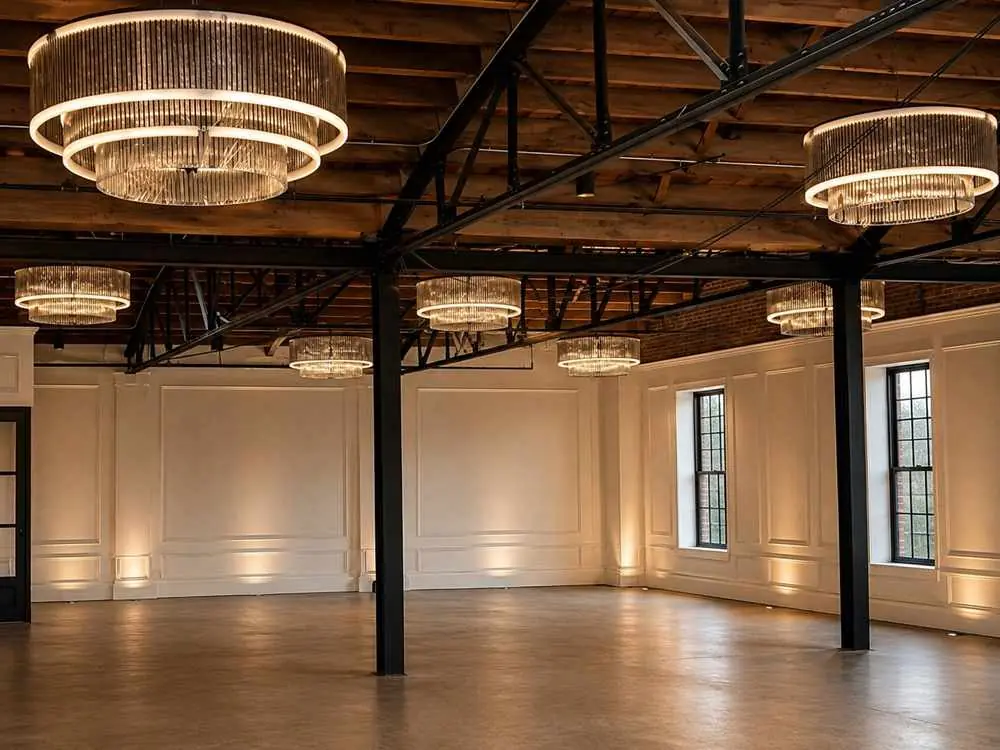
A working Houston gala venue layout has to hold three separate events in one night. Check-in, silent auction, and seated program each want different things from a floor plan. Most committees don’t ask whether a room can do all three until the walkthrough is over. Rooms that only manage two are why your 6:00 arrival turns into a 7:40 salad course. The fix is almost never more square footage. A Houston gala venue layout works or fails on how the space is divided, where the doors are, and what happens in the twenty minutes nobody plans for. Start With the Arrival Curve, Not the Guest Count A 400-guest gala does not arrive as 400 guests. It arrives as roughly 40 people in the first fifteen minutes. Then 260 in the next half hour. Then a long tail of stragglers who show up during the invocation. That middle block is what breaks check-in. Plan for it directly. Assume 60–65% of your total headcount walks through the door inside a 30-minute window. If you’re expecting 400, build check-in to absorb 250 people in 30 minutes. Standard throughput for a check-in station runs about 25–30 guests per hour when the card is already on file. That’s one guest every two minutes per station. The process has to stay clean: name lookup, card confirmation, bid number, table card. It also assumes your volunteers aren’t fielding “can I switch tables” questions. Do the math and it gets uncomfortable. 250 guests in 30 minutes at 30 per hour per station means ten stations. Most committees build four, then wonder why the line reached the sidewalk. Two Fixes That Cut Your Station Count Alphabetical splits. Break stations by last name — A–F, G–L, M–R, S–Z. Post the signage above head height so people sort themselves before they’re in line. This alone cuts effective wait time by a third, because the queue self-distributes. Pre-assigned bid numbers, mailed or emailed in advance. If the guest already knows they’re bidder 214, the volunteer is confirming a name and handing over a packet. That’s a 40-second interaction instead of two minutes. It roughly doubles your per-station throughput. There’s a third lever worth naming: an express lane for sponsors and table captains. Sponsor tables are usually 20–30% of the room. They’re also the guests you most want to feel taken care of. A dedicated table with a named volunteer who knows the sponsor list keeps your major donors out of the crush. Where Check-In Sits in Your Houston Gala Venue Layout The mistake is putting check-in inside the room where the auction lives. Guests who clear the table immediately stop walking and start browsing. The line backs up into itself. Check-in belongs in a lobby, corridor, or entry space physically separate from the auction. Flow should run one direction, from check-in into the auction area. Guests should never walk back through the check-in line to get anywhere. At Grand Central Houston, the entry sequence is built around that separation. It’s one practical reason committees plan a Houston gala venue layout in a purpose-built space instead of a hotel function room where check-in and cocktails share a hallway. Silent Auction: Separate Room or Dinner Room? This is the single biggest decision in any Houston gala venue layout. The honest answer depends on what you want the auction to earn. The Case for a Separate Space Putting the auction in its own Space during cocktail hour concentrates attention. Guests have a drink, no chairs, and nothing else to do but look at items. Bidding activity per guest runs meaningfully higher when there’s no competing seating to sink into. It also solves your changeover problem. If the auction lives in a different room than dinner, your catering team can set and light the dinner room while guests are occupied elsewhere. Nobody watches banquet staff drag chairs around. You don’t have to clear a cocktail crowd out of a room you need to reset. The trade-off is that you have to physically move people. That costs time and creates a second crush at the dinner room doors. The Case for One Room Auction tables lining the perimeter mean guests keep bidding between courses. Late bidding — the last twenty minutes before close — is where a large share of the final total gets made. Proximity drives it. The cost is atmosphere. Perimeter auction tables push dinner tables toward the center and make the room feel tighter. Service gets harder too, because waitstaff need aisles exactly where auction traffic wants to be. The Version That Usually Works Split it. Put the bulk of your items in a separate Space during cocktail hour. Move six to eight high-value pieces into the dinner room on tall cocktail rounds near the perimeter. Close the outer-room items at the start of the program. Hold the in-room items open through the first course. You get concentrated cocktail-hour browsing plus a late-bidding tail on the pieces that matter most. Table math for the auction itself: allow one 6-foot table per 8–10 items, depending on item size. Add 4 feet of clear circulation behind each row. Sixty items means 6–8 tables and a footprint much larger than the tables themselves. Committees consistently underestimate circulation. The result is a room where nobody can read the bid sheets, because there’s always a shoulder in the way. Mobile bidding changes this equation but doesn’t erase it. Guests still want to see and touch the items. You need the same display space, just fewer clipboards. Sightlines: The Back Table Test Run this test before you sign anything. Walk to the farthest table position from where the podium will stand. Sit down. Look at the podium. If you’re looking at the back of a centerpiece, a column, or a screen edge, you’ve found your problem. The people at that table are your smallest donors tonight and your prospective major donors next year. You’re about to give them 45 minutes of someone’s shoulder. Four Thresholds Worth Measuring A room with clean sightlines to a single focal point beats a bigger room with a post in the middle. Our Vanderbilt and Madison Spaces are worth walking with the back-table test in mind. Sponsor Signage: Four Placements That Get Seen Sponsors renew based on whether they felt visible. Signage placement is a fundraising decision, not a decor decision. The check-in wall. Every guest stands in front of this for two to six minutes with nothing else to look at. It’s the highest-attention surface at the event. It’s routinely wasted on a plain step-and-repeat carrying only the organization’s logo. Auction table headers. Card stock signs at the head of each row, naming the sponsor underwriting that category. Cheap, effective, and it gives mid-tier sponsors something concrete. Stage-adjacent panels, not the backdrop. Logos directly behind a speaker read as clutter in photographs and get cropped out of anything usable. Flanking panels at the edges of the stage survive the crop and stay legible from the back. The program running order. Verbal recognition, one line per tier, spoken by the emcee rather than read off a list. Sponsors remember being named out loud. They don’t remember a logo